The Psychology of Color in a Minimalist Design
Colors aren’t just pretty to look at – they can change how we feel! In this design, we use minimalist color palette magic to create calm, peaceful spaces. Think of your home as a big mood ring. The colors you choose can make you feel relaxed, energized, or even hungry (hello, red kitchen)!
In minimalism, we usually go for colors that make us feel chill. Soft whites, gentle greys, and warm beiges are like the comfy sweatpants of the color world – they just make you want to relax. But don’t think minimalism means your home has to look like a blank canvas. We can use colors in smart ways to create the perfect vibe.
Blues and greens, for example, are like nature’s chill pills. They remind us of the sky and trees, which can make us feel more peaceful. On the flip side, yellows and oranges are like little shots of sunshine. They can make a room feel warm and happy without being too in-your-face.
Here’s a cool trick: think about how you want to feel in each room. Want your bedroom to be super relaxing? Soft blues or lavenders might be your best bet. Need a boost of energy in your home office? A touch of cheerful yellow could do the trick. The key is to choose colors that make you feel good – after all, it’s your home!

Choosing a Base Color for Your Minimalist Palette
Alright, now that we know colors can be mood-makers, let’s talk about picking your star player – your base color. In minimalist design, your base color is like the canvas of a painting. It sets the tone for everything else.
Most minimalist homes start with a neutral base color. But neutral doesn’t mean boring! We’re talking about a whole family of colors here – whites, beiges, greys, and even soft blacks. Each of these has its own personality.
White is the classic minimalist choice. It’s like a blank slate that makes everything else pop. Plus, it can make your space feel bigger and brighter. But here’s a secret: there are tons of different whites! Warm whites have a touch of yellow and feel cozy, while cool whites have a hint of blue and feel more modern.
Grey is another minimalist superstar. It’s like white’s sophisticated cousin. Light greys can be calming and elegant, while darker greys add drama without being too bold. And don’t forget greige – that magical mix of grey and beige that goes with practically everything.
If you want something a bit different, consider a soft black. I know black sounds scary in a minimalist design. But a soft black (more like a super dark grey) can be incredibly chic and cozy.
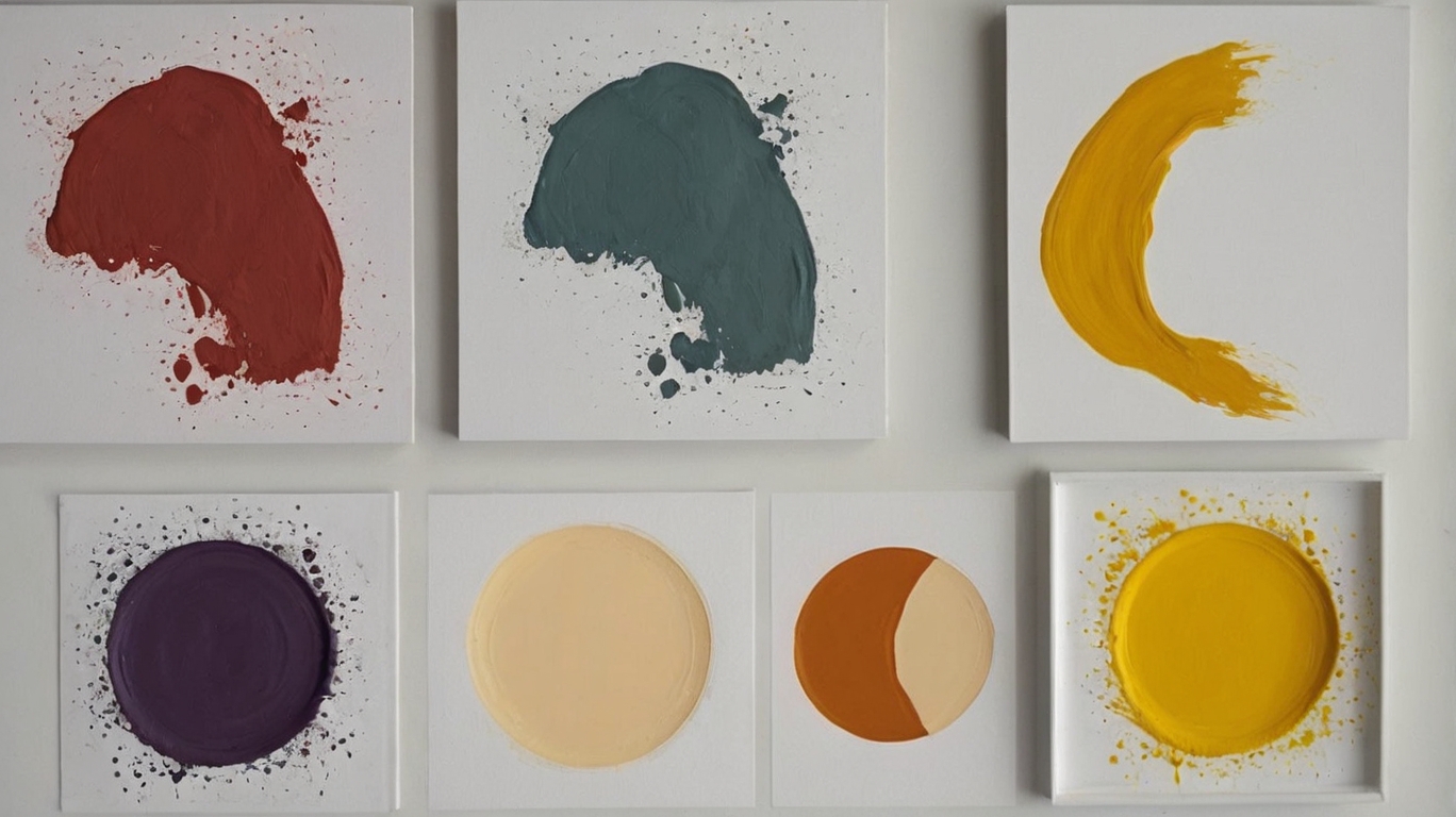
When you’re picking your base color, here’s a pro tip: look at the color at different times of day. Paint a small spot on your wall and check it out in the morning, afternoon, and evening. Colors can change a lot depending on the light!
Remember, your base color is going to be the backdrop for everything else in your home. So choose something that makes you happy every time you see it. And don’t be afraid to test out a few options before you commit. It’s all part of the fun!
Incorporating Accent Colors Without Overwhelming the Space
Now that we’ve got our awesome base color, it’s time to add some personality with accent colors. But wait! Before you go color-crazy, remember: in minimalism, a little goes a long way.
Think of accent colors like jewelry for your room. You wouldn’t wear every piece of jewelry you own at once, right? The same goes for colors in a minimalist space. Pick one or two accent colors that play nicely with your base color.
Here’s a cool trick: look at the color wheel. Colors that are opposite each other (like blue and orange) create an energetic vibe. The colors next to each other (like blue and green) feel more harmonious. For a minimalist look, you might want to stick with those neighbor colors or go monochromatic (using different shades of the same color).
Now, how do we add these accent colors without making the room look like a rainbow exploded? It’s all about balance. Try the 60-30-10 rule: 60% of the room is your base color, 30% is your secondary color, and 10% is your accent color. This keeps things interesting without being overwhelming.
Let’s say you’ve got a lovely grey living room. You could add some soft blue throw pillows (your 30% color) and a bright yellow vase (your 10% pop of color). Boom! Instant style without the clutter.
Remember, in minimalist design, every item should earn its place. So, make your colorful pieces count! A bold piece of art, a colorful rug, or even some vibrant flowers can add just the right amount of pizzazz without cluttering up your space.
And here’s a secret: your accent colors don’t have to stay the same forever. Switching out a few colorful items is an easy way to give your room a whole new look without repainting or buying new furniture. It’s like a mini makeover whenever you feel like it!

Tips for Using Textures to Add Depth to a Monochromatic Scheme
Okay, let’s talk about another aspect of minimalist design: texture. When you’re working with a limited color palette, textures become your best friend. They add interest and depth to your space without messing up your color scheme.
Think of texture as the thing that makes you want to reach out and touch stuff. It’s what makes a room feel cozy and lived-in, even when it’s super simple. And the best part? You can go texture-crazy without adding any extra color!
Let’s say you’ve got an all-white bedroom (very chic, by the way). Without texture, it might feel a bit like sleeping in a cloud – nice in theory, but maybe a little boring. But add a fluffy white rug, some crisp white cotton sheets, and a chunky knit throw blanket, and suddenly your room is a cozy minimalist paradise!
Here are some cool ways to add texture:
1. Fabrics: Mix up your textiles! Combine smooth cotton, nubby linen, sleek velvet, and chunky knits. Even if they’re all the same color, the different textures will make things interesting.
2. Natural materials: Wood, stone, and plants are texture goldmines. A smooth wooden coffee table, a rough stone vase, and some leafy plants can add tons of character to a room.
3. Wall textures: Who says walls must be smooth? Textured wallpaper, a brick accent wall, or even some cool 3D wall panels can add major depth to your space.
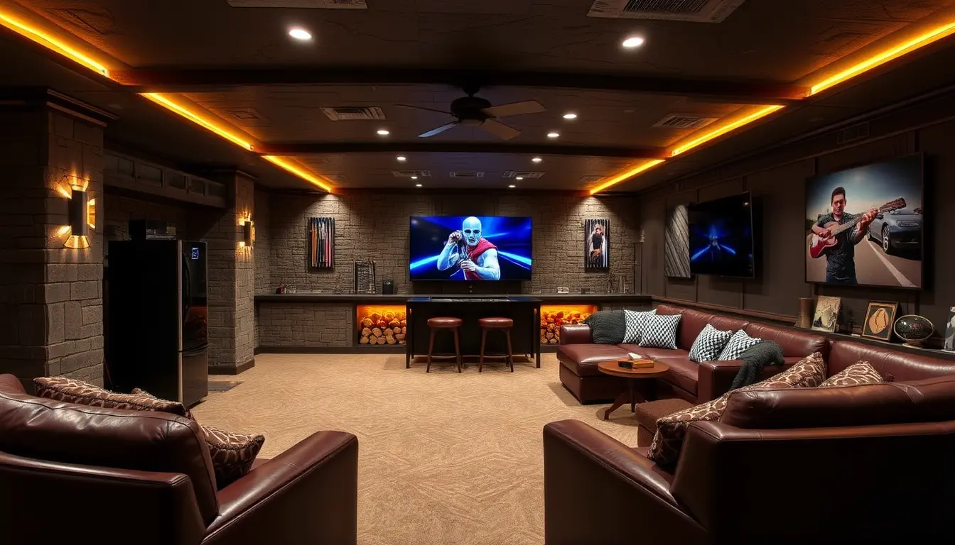
4. Layering: Overlapping textures create depth. Try layering rugs or adding a textured throw over a smooth leather chair.
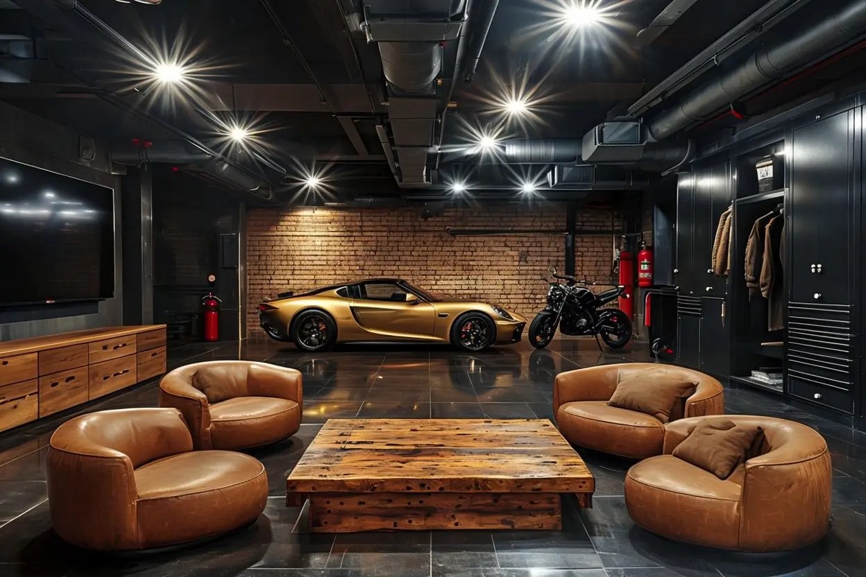
5. Contrast: Mix rough and smooth textures for extra impact. A sleek metal lamp on a rustic wooden table? Perfection!
Remember, the goal is to create a space that’s interesting to look at and touch, even when you’re keeping things simple color-wise. And a bonus: playing with textures can make your room feel warmer and more inviting – perfect for those of us who worry minimalism might feel too cold or sterile.
So, there you have it, folks! You’re now armed with all the color and texture knowledge you need to create a minimalist home that’s anything but boring. Remember, the key to minimalist design is intentionality. Every color and texture should be there for a reason, creating a space that feels calm, harmonious, and totally you.
Why not start small? Try adding a textured throw pillow to your couch or swap out a bright accessory for something in a more subdued, complementary color. Play around and see what feels right to you. After all, your home should make you happy every time you walk through the door.
And hey, we’d love to hear about your minimalist color adventures! Drop a comment below and tell us about your favorite color combos or texture tricks. Are you an all-white-everything fan, or do you like to spice things up with bold accents? Share your stories – we’re all in this minimalist journey together!

I’ve mentioned the psychology of color but I’d like you to be aware of color psychology and the role it plays in our lives, how it effects our moods and well being. You can find this information here.


